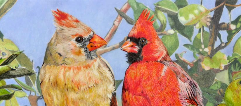
Ok so I’m not particularly fond of this piece. There’s nothing actually wrong with it, I suppose, but the subject matter is a bit odd. There are some birds that never look right, in photos or in art, and I’m afraid the Northern Cardinal is one of those species. American Oystercatcher is another, and Mark says that his photos of Wood Duck, undeniably a bright and colourful bird, always look wooden and unreal. He says that is the case with this piece of mine and I have to agree. He even suggested that I not post it, but I decided to do so-‘warts and all’, as Oliver Cromwell is reputed to have stated!
So given my issues with Northern Cardinals-I have had a go before (see Merry and Bright… and Cardinal Red)-why did I choose to try again for my ‘Yard Birds’ series? Basically, because of the colours! I’d just finished and American Crow piece (see Crowin’), before that an Eastern Kingbird (see King of the Yard) and a White-breasted Nuthatch (see Nuthatching), all shades of grey and black, and I really fancied trying something with intense colour-and you can’t beat a male Northern Cardinal for intense colour!
I found a couple of pictures of male and female Cardinals from Mark’s photo files. Now these were taken at different times of the year but I thought I could place the female sitting further down the branch that the male was occupying so that they would both be in a late summer context. My first issue here was getting the sizes the same. Now I thought I’d nailed it, but the female ended up looking larger than the male-I think it is a function of the side-on view of the female’s head compared to the diagonal view of the male. Anyhow, a lesson learned-best to have the second bird a little smaller in similar circumstances in the future.
I pulled out tons of orange and red/vermilion pencils for this piece, some of which had never before seen the light of day in one of my pictures; that was rather satisfying. And I really think I did a good job replicating the colours of the plumage; there seemed to be a good level of vibrancy in those reds and tawnys. Now for the ‘background’.
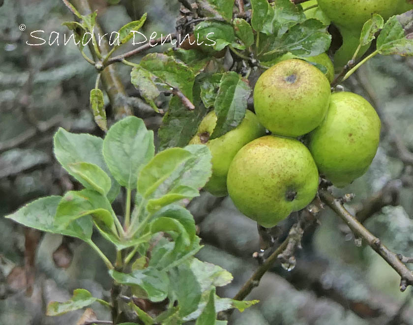
As I said, the birds look a bit ‘odd’, but I hoped that that would be toned down by adding in some foliage. I had decided on the late summer context so the red berries wouldn’t feature, rather it would be the greens of the apple tree that the male was sitting in. Some apples would be a nice touch, too, and add interest, but the fruits in my reference weren’t really visible. Still, that was easily sorted-it is late summer and the same apple tree is just outside our back door, laden with fruit. It was the work of moments to head out there and photograph some references-actually, since it was raining cats and dogs, I stood on the back step and took photos from the house!
There, that was enough examples of apples and leaves to fill in the background satisfactorily.
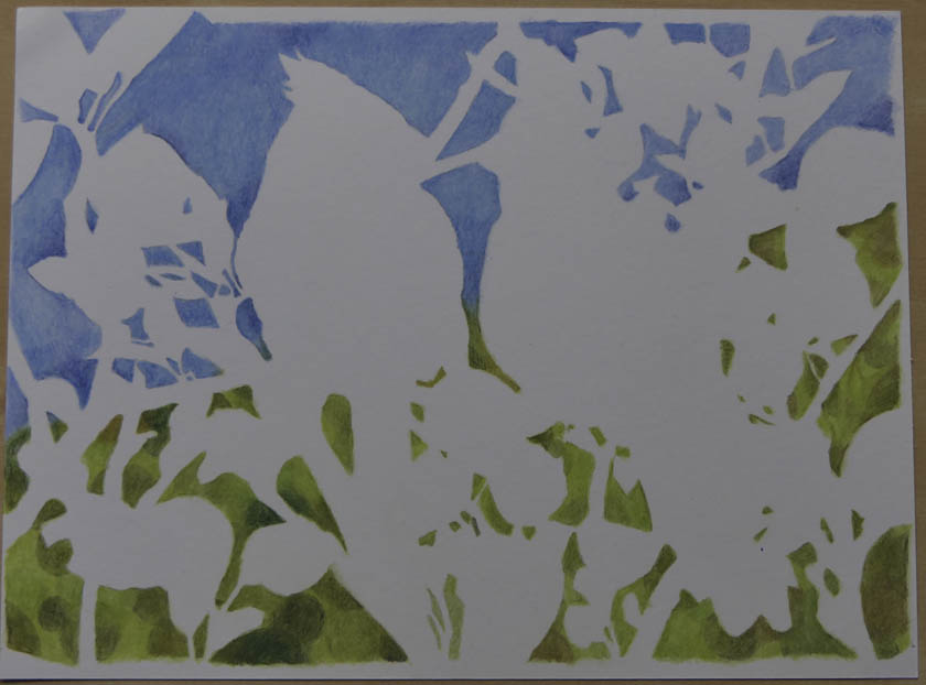
I decided to take advantage of the film properties to allow me to do a ‘3D’ effect-some branches and foliage on the front. some on the back, and a layer of bokeh on the backing sheet.
Birds, perch, much of the foliage and apple on the lower right-hand side and the end of the perch/one small twig on the left-hand side are drawn on the front of the sheet.Foliage/fruit at top left, top right , lower right and centre are all drawn on the rear of the filmThe background sheet (Canson Bristol) has coloured pencil added, blended with OMS. I chose to largely avoid areas where the drawings were on the film (the white bits) to avoid influencing the colours on the top sheet with the background colours.
Putting it together, it sort of works, but won’t be going on my ‘top ten’ list. Still. I quite enjoyed it.
‘In the Apple Tree (Northern Cardinals)’, 9 x 12 inch coloured pencil (Lightfast, Luminance, Polychromos, Pablo) on Dura-Lar 0.005 double-sided matte film. Background is coloured pencil (Polychromos, Luminance, Pablo, Coloursoft), blended with OMS (Gamsol) on Canson XL Recycled Bristol (smooth side).
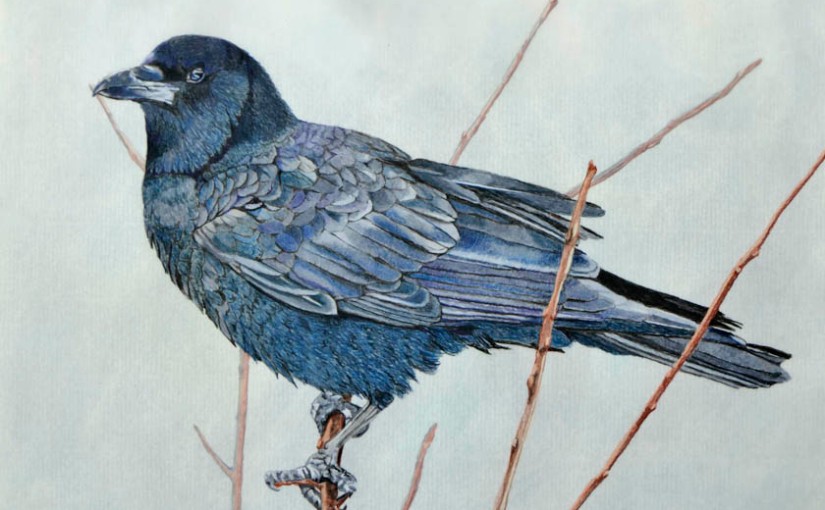
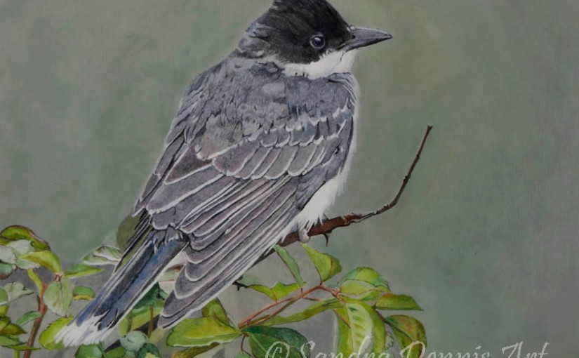
Back with the yard birds series and a subject that I thought might be a bit of a challenge-American Crow. Why a challenge? Well, crows are black, aren’t they? Wouldn’t it just look like a bird-shaped black hole?
Yes, crows are black, but those feathers reflect a lot of other colours, too. I’d need to get my feather details right if it was going to look something like a bird. I had a photo reference, another of Mark’s photos taken a few tears back in the yard, and there were lots of blues in that plumage.
It had been sleeting when the photo was taken, so I had to decide whether to go with that. In the end I decided that it was just an added complication that wouldn’t add much to my piece, although it is a nicely atmospheric addition to Mark’s photo! The main takeaway was the plethora of blue tones in the plumage of an ostensibly black bird.
As this was part of the ‘Yard Birds’ series, I stuck with the drafting film. My first job was to extract all the pencils I thought would be useful from my four main pencil sets and lay them out by my drawing board. This included some of my most useful, and used, colours, such as Luminance Dark Indigo and the Payne’s Greys, Lightfast Black (currently my favourite black pencil), Polychromos Payne’s Grey, and Pablo Ivory Black. It was also a chance to use a few lesser-used colours, notably Lightfast Midnight Black (a very blue-black colour), Dark Cyan and Dark Indigo, Luminance Slate Grey, Polychromos Dark Indigo and Pablo Indigo Blue.
The ‘Crow Palette’
It took a while but I think I got there. It was fun trying to get those feather tracts looking something like, but Mark has approved so it must have worked. Most of the feathers were drawn with varying amounts of the Payne’s Greys from Luminance (which have a distinct blue tone), with the addition of Dark Indigos (the three colours marked as ‘dark indigo’ vary quite a lot in colour!) and Indigo Blue, but perhaps the MVPs (most valuable pencils) this time were Lightfast Midnight Black and Dark Cyan. I was pretty pleased with the layering of these two colours, used on the head and breast of the bird. I really reserved the black pencils for shadows, shading and feather edges.
That’s not to say that I didn’t use them freely, and I was sad to say goodbye, finally, to an old friend-my Lightfast Black pencil has finally finished after a couple of years of service. It’s been in a pencil holder for at least a year, and it’s one of my favourite pencils, comes out for every piece, so it’s seen a lot of use. What remained is a testament to the usefulness of the pencil holder.
That’s what I call a well-used pencil!
Incidentally, I have found it possible to continue to use my Afmat electric pencil sharpener with pencils in holders, even when they are almost this short. How? I remove the top! It might not be best practice, and you do need to hold the pencil pretty upright, to avoid uneven sharpening (and be careful to keep your finger out!) but it works and has prolonged the life of my pencils and avoided the dreaded manual sharpening. There is nothing more annoying than having to break off concentration yo do a two-handed manual sharpen instead of just leaning over to the electric sharpener.
Well, there’s probably a lot of things more annoying in this world, but it can be a bit of a pet peeve!
My favourite pencil extenders (bought from Amazon)The Afmat electric pencil sharpener
Oh, and I had a spare Lightfast Black pencil in my stores, ready to go, so no worries about losing my favourite!
I decided to do some of the twigs on the front of the paper and the remainder on the back, to give the 3D effect. I also went over some of the darker areas of the bird, notably the head (around the face) and neck, the underside of the far wing and the areas of deep shadow with further black pencil, on the back of the film. I chose to use Derwent Drawing ivory Black, here, as it is a very soft pencil snf gives a lot of coverage very easily. When I turned the piece to the right side, this black had reinforced the depth of colour without blotting out the finer feather detail and the overall blue colour cast. I was pretty pleased with the addition of the rear shading.
I finished up with a PanPastel background sheet. With such a dark subject, I didn’t need to concern myself with trying to avoid colouring the background sheet under the bird, which was a big saving of time. The final background was a bit greener than I was originally aiming for but I’m ok with it. Probably to get a similar result to the reference photo I’d have had to resort to coloured pencil rather than pastel, and that would have taken a lot longer to do.
‘American Crow’, 9 x 12 inch coloured pencil (Lightfast, Luminance, Polychromos, Pablo, Derwent Drawing Ivory Black) on Dura-Lar 0.005 double-sided matte film. Background is PanPastel on Brea Reese 105 lb acid free heavyweight canvas watercolour paper.
So, between drawing my Yard Birds, I’ve been working on updating the covers for the Nova Scotia Birder Mysteries. After completing a revamp of the Thompson Nottingham series (see Where Have You BEEN?) we were so pleased with the more ‘professional’ look for the series, and how it now looked like a series, that we were determined to do the same for the NS mysteries, which actually had very disparate covers.
Still, I was at something of a loss for a linking theme-birds, of course, would feature but what else? For the Nottingham books I’d used (mainly) Nottingham scenes, suitably manipulated, and added part of the original hand-drawn cover pictures.
The NS books didn’t have the hand-drawn covers (although there were drawings inside), so what to do to make the covers recognisable? It didn’t click until Mark suggested lighthouses as the theme-NS is famous for its lighthouses, after all; there are said to be 160 of them, more than any other province. Not only that, I was pretty certain that I could find a good number of lighthouse photos in my photo files. It was the inspiration I needed. He also said that he’d rather like the books to be blue in hue, rather than the multicoloured tones of the Thompson series. Good, I could work with that!
Now the issue with book covers is that the ‘interesting bit’ has to be on the right-hand side of the photo, so that it appears on the front of the book! So some of the photos I had needed to be manipulated a bit, or even reversed totally. Sometimes the lighthouses were in the wrong place, surrounded by ancillary structures, or too small. A bit of Photoshop magic sorted that out. Also birds were needed, something that we are not short of photos of round here, so I was able to pick out suitable species from Mark’s photos, cut them out and convert them to PNG files so that they could be inserted into the cover photo. That technique, which I learnt to do only this year, has been a revelation!
I wanted the birds to be ‘true colour’, so I couldn’t insert them until I’d colourised the background picture in Photoshop Elements, using ‘enhance’, ‘adjust color’ and then ‘adjust color/saturation’. Then, clicking the ‘colorize’ button and using the ‘Hue’ slider to get the right colour for the whole picture. followed by choosing ‘adjust color curves’ and then choosing ‘increase contrast’ gave me the colour and sparkle I was looking for. Putting the photo back into PagePlus, I could then add the birds and the text as wanted. I was liking the look.
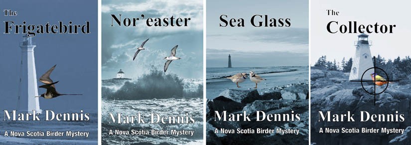
For the first in the series, ‘The Frigatebird, I decided to use a picture of mine of our local lighthouse, the Cape Light. I took the photo from The Hawk so it was a long way away and not entirely sharp but I liked the effect. I found a Magnificent Frigatebird photo of Mark’s (from Venezuela, no less) and isolated the bird. I chose a mixture of Times New Roman and Basic Sans Heavy SF fonts for the titles, author name and blurb. I was pretty happy with the result.
Now to set up the other books.
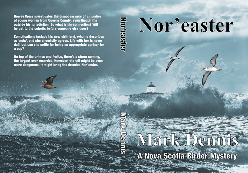
For ‘Nor’easter’, I didn’t have a photo that really gave the impression of a stormy sea, especially not with a lighthouse in the right place. I’d clearly have to improvise. This was the only cover where I had to resort to a Pixabay image for the main picture. I did decide to add an offshore lighthouse, this time one of my own photos, of a lighthouse near Canso, which I wanted to have in the photo before I went ahead with the colourising process. The birds, Great Shearwaters and a South Polar Skua, were all taken from Mark’s photos.
The final cover might well be my favourite one of the four.
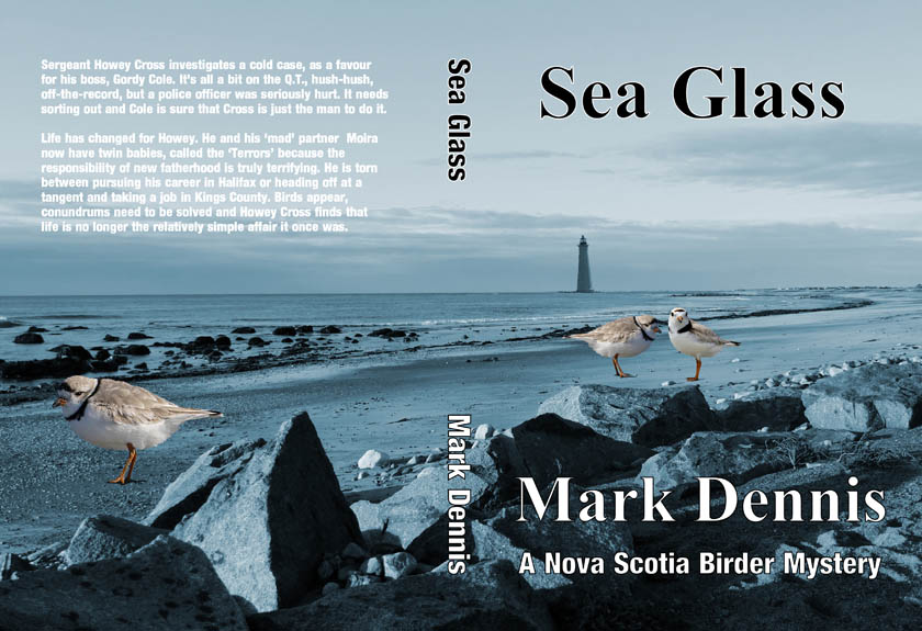
For ‘Sea Glass’, with its theme of Piping Plover beaches, the plovers were an obvious bird subject (and Mark has plenty of photos) but I needed a beach scene, preferably with a lighthouse. I had a photo, of The Hawk beach here on Cape Sable Island, and there is a lighthouse in it, but it was a very small image. Still, that didn’t matter because I could add in a bigger image, taken from another photo of the Cape Light. It is a Piping Plover Beach, too, although the birds are not actually to scale!
For ‘The Collector’ we didn’t have a particular site in mind, so I chose a good lighthouse, the Boar’s Head lighthouse on Long Island, as taken from the Petit Passage Whale Watch boat. I thought I could use the Painted Bunting (Mark’s photo) that was on the original cover and looked for a better set of crosshairs-I’m embarrassed to say that the last cover involved me drawing and cutting out the crosshairs, sticking them to an actual photo of the bunting and then scanning the whole thing! We’ve come on a bit since then. I found a PNG image of crosshairs on Pixabay, and they worked very well. Yet again, the bird is not to scale and isn’t meant to be!
So we went ahead and re-published all four books, and our copies of the paperbacks arrived here, today-we have to buy our own copies, even though Mark is the author. I have to say we were jolly excited and very pleased with the result. They do look very much like a series now, and any further books will follow the convention (I’ve already started putting together the cover for book 5, ‘The Final Tick’, and it has a lighthouse, a bird and is blue!). The new paperbacks took their place on our ‘self-published’ bookshelf, 34 books and counting. It’s looking pretty impressive, at least I think so!
All of Mark’s books, and the travelogues we wrote together, are available as paperback and ebook, from Amazon.
Back to the birds! Still working on my ‘Yard birds’ series and I had a nice photo of Mark’s of an Eastern Kingbird taken in the garden. We get odd ones, staying only a short time, but pretty much annually. They are always a nice species to see.
I am planning to do all of the yard birds on the drafting film, so the medium was obvious/ I decided to simplify the leafy background, though. I wanted to have a go at the wet leave, but my water drops were not very convincing, so I gently erased them and went for a dry foliage. I wanted a darker background, too, so chose to add PanPastel to the back of the film as well as to the backing sheet. Its messy, and you have to make sure that you haven’t handled the back of the film too much as the pastel will find, and adhere to, every fingerprint! It’s also very humid here, at the moment, so all of the pencils are softer than normal. Anyway, I was pretty happy with the result.
The blue-greys of the Luminance (Payne’s Grey and its dilutions) and Pablo sets got a pretty heavy work out on this one!
‘Eastern Kingbird’, 9 x 12 inch coloured pencil (Lightfast, Luminance, Polychromos, Pablo) on Dura-Lar 0.005 double-sided matte film. Background is PanPastel on Brea Reese 105 lb acid free heavyweight canvas watercolour paper.
Its been a while. Again I have been pulled away from my drawing board due to the need to work on books. This time it was a re-branding of Mark’s Birder Mystery series, so I worked on new covers, updated formatting, etc., on the four published novels so that they should look more like a coherent series, much like the work I did on the Nottingham detective series (see Where Have You BEEN?). We haven’t relaunched the Birder series yet, so I’ll not spoil the surprise. Expect book 5 sometime later thsi year, too!
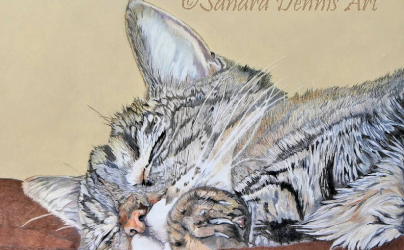
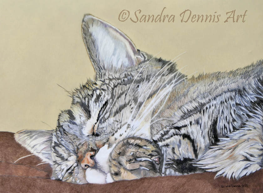
I have had a whole lot of pictures by my drawing board, ready for the off, so to speak and so, when I finally got a minute to myself, I was straight into it. I’m still working on the Yard Birds series but I really fancied an animal for my first go again since May. I had a photo I’d taken of our own cat, Bubbles, asleep. This is a common position for her, no-one can sleep like a cat!
Still, Bubbles is an old lady nowadays (18 and counting!) so she’s allowed as much sleep as she wants. One of her favourite perches is on the back of the sofa. There’s a sort of groove, where the back cushions meet the back of the sofa and she settles into that and off she goes. I think it gives her a good view of anyone or anything moving about in our open-plan living room/kitchen, although once she’s out for the count, a bomb could go off and she wouldn’t notice.
Anyway, I loved the expression on her little face (aww!) and the front paw curled over in front of her chin. I wasn’t so keen on the rear leg at the front (and out of focus in my picture) but I thought I could leave that out and it still look good. Getting the closed eyes to look ‘real’ I thought would be an interesting challenge. Anyway, who doesn’t like a sleepy cat picture?
Bubbles is known by many names around here; ‘Boo’, ‘Boo-Boo’. ‘Bublington’, ‘Bubs’, ‘Bubbly’ and even ‘Princess Pea’, to name a few. The latter comes from her unerring instinct to find the most comfortable place to settle, even if it means clambering up a 4 ft high stack of cushions to sit on the very top-no mean feat when you are an elderly lady with a gammy hip! ‘Boo’ is perhaps the most common nickname, that’s why I names the final piece ‘Boo, Dreaming’. I used drafting film, because it has become my favourite surface and is so very good for fur, and the standard four pencil sets (Lightfast, Luminance, Polychromos, Pablo). The backround was PanPastel on watercolour paper.
‘Boo, Dreaming’, 9 x 12 inch coloured pencil (Lightfast, Luminance, Polychromos, Pablo) on Dura-lar 0.005 double-sided matte film. Background is PanPastel on Brea Reese 105 lb acid free heavyweight canvas watercolour paper.
I’ve got a bird in the ‘Yard Birds’ series lined up for the next piece, but, before that, I have to put my ‘editing and layout’ hat back on for mark’s latest novel, hot off his laptop and ready for the first read-through. He keeps me busy! This will be novel number 13 and book number 34 in the Dennis Publishing Empire!
I’ve been busy for a little while, so busy that I’ve not had time to draw anything much. That doesn’t mean I haven’t been being creative-well, at least I think it’s creative 🙂
As I have mentioned before, Mark writes books, and I usually get involved in the editing, illustration and cover design aspects of our self-publishing empire. Well, when I say ‘our’, I guess it really is Amazon’s, but at least they make publishing relatively simple. Nowadays, after 30 books, we’ve got the publishing side down to a fine art, with the ebooks generally being available just a few minutes after clicking the ‘publish’ button-the paperback version generally takes a little longer but there is rarely an issue with that, either. It was not always thus.
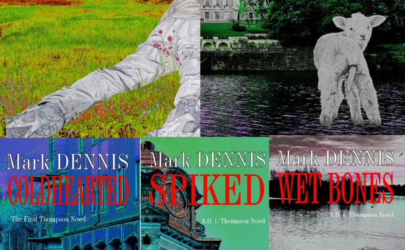
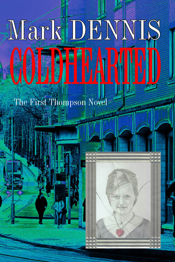
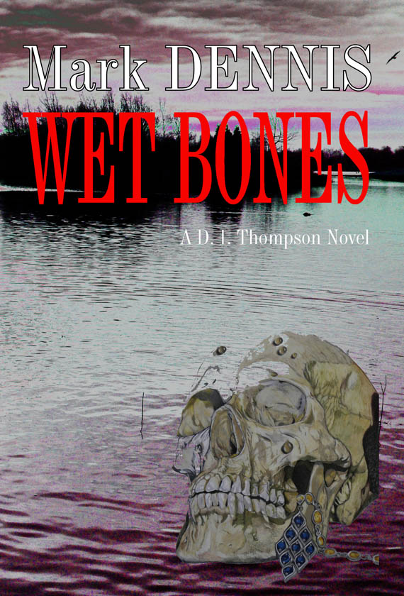
The last book that Mark published was ‘Wet Bones’, number 4 in the D.I.Thompson Nottingham Mystery Series. For these books I have been doing a cover drawing of something that seemed relevant, the last one being ‘Clarence Wetbones’ (see Clarence Wetbones). The cover text fonts. colours and placements for each book were unique to that book. It didn’t shout ‘series’, did it.
The Nottingham Series Book Covers
We were talking about this and thought that it might work better to have a themed set of covers. I’m a big reader of UK crime fiction and have many examples of series published by ‘proper’ publishers. Generally, it involves a photo cover, either monochrome or in moody colours, with the author name and title in the same font throughout the series-clearly we were not following that convention, here!
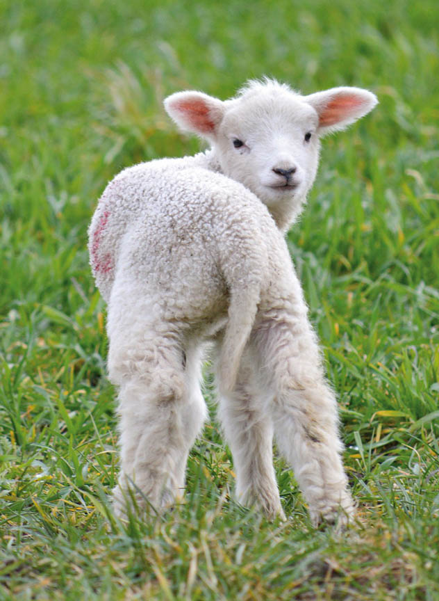
Mark already had the fifth book in the series, ‘Lamb’s Tail’, nearly ready to go, so I thought I’d have a go at updating the whole series in time for the next installment. I had already done a cover illustration, of a lamb, expecting this to have the drawn cover (see Bah, Lamb), but it didn’t make sense to go ahead with that now that we’d decided on a change. First thing, first, I had to source some suitable ‘moody’ photos.
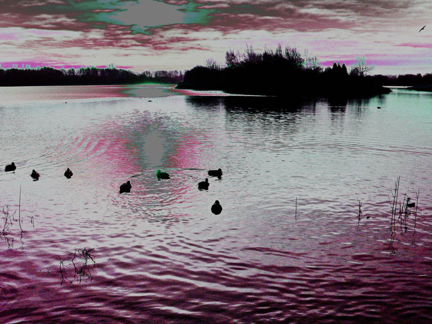
As I mentioned, this series is set in the city of Nottingham in the UK, home of Robin Hood, etc., and Mark’s home town. You’d think, therefore, that we’d have lots of photos of the place but not so. It’s always the same, you don’t tend to photograph the place you live. Also, we really only got into digital photography after we left so what we do have would be prints and probably lacking the quality needed for a book cover. I did have a few photos of Colwick Park from a previous trip back to the UK, and the ‘wet bones’ of the fourth book were found there, so maybe that would work.
Colwick Park Lake-Sandra Dennis
Ok, fairly moody but was it moody enough? And what about the rest of the books? Well, I thought I’d take a look on Pixabay for free, copyright-free photos of Nottingham and was delighted to find some!
A street sceneHighfields LakeClock tower, Victoria Centre
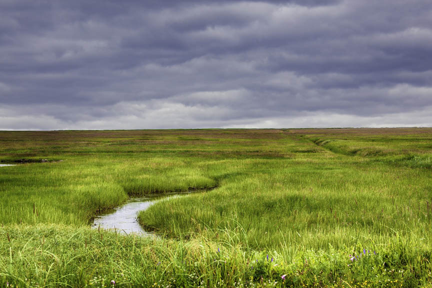
Again, not exactly moody but I thought I could do something with them. I did need one more picture, really of open marshy country, and there wasn’t anything suitable in the Nottingham file, but the picture below was under ‘marsh’. It doesn’t really resemble the country around the city, but there’s such a thing as poetic licence!
Now for the moody. I thought I’d import the photos into Photoshop Elements and see what I could fiddle with. I found the Hue/Saturation setting most useful for adding drama. For example, I’d decided to use the street scene for ‘Coldhearted’ and so wanted a blue tinge added. The marsh photo would be for ‘On The Fly’ and for that I whacked up the red hues. The clock tower would do for ‘Spiked’ but I wasn’t sure what would work, so I fiddled with the settings until I got an otherworldly, mainly green/red and saturated hue. The Colwick Lake was for ‘Wet Bones’, and took on a pinky-purple tone, whilst Highfields was perfect for ‘Lamb’s Tail’, because it features in the text. This also got the purple treatment. The final stage was the ‘solarize’ button, which gave each photo a weird glow that I liked.
So far, so good, but I wanted to add something that made these pictures unique to this series, and I also wanted to link the new covers to the old ones. I decided to apply some part of the old drawn covers to the new cover picture. Now, I have a confession, I only just learned how to ‘cut out’ part of a photo and apply it to another picture, in Photoshop! I’ve been using the thing for years and never knew how-I’ve even been known to cut things out, stick them on a physical copy and then scan it (shakes head, mournfully). Armed with this new knowledge, I decided to use the photoframe from ‘Coldhearted’, the body from ‘On The Fly’ (reversed), one hand and the ball from ‘Spiked’ (again reversed), old Clarence from “Wet Bones’ and the lamb for ‘Lamb’s Tail’. Then it was just a matter of choosing a suitable font, colour and placement for the cover text- I chose a no nonsense font called Industrial 736 BT for titles and author, the title in bright scarlet, and Bahnschrift semi-bold for the back blurb- and then updating all of the interior texts to share the same format, font and layout and the job was a good ‘un.
I said that our technique for publishing had changed. When we first started texts were uploaded to Kindle KDP as word documents, with JPEG cover files. That’s what we did for the first three books in this series and we used to get all sorts of issues, especially in the ebooks, with things moving around. Now we’ve learned better and the paperback texts are uploaded as PDFs, as are the paperback covers. Since doing that we’ve had no issues. The ebook version text is now uploaded as a EPUB file (I convert using a free program called Calibre) and only the cover is a JPEG. Things moving about in the body of the book are a thing of the past and the uploaded files are accepted almost immediately. Life is so much easier.
So Mark published his latest book, ‘Lamb’s Tail’, earlier today and the ebook is already available (at the hefty price of 99c CDN), the paperback will take a little longer (and be rather pricier). We aslo updated all of the other four books, with new covers and reformatted texts. I’m rather pleased with the new look.
I’m off the hook, for a while, with the next book likely to be a few weeks off, so I think I’ll have time for a bit of drawing.
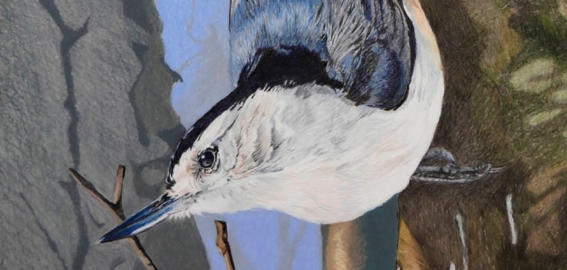
Another of the yard birds series finished today! I admit that I struggled rather with the last one (see Purple Patch) so I really wanted a striking image for my next go. As I’ve said, I’m drawing birds that we see, or have seen, in or from our garden (‘yard’, in North American terminology) so I’ve been trying to source photos actually taken in the yard for most of them. So far, so good, but it didn’t make much sense to ignore a really striking photo of a bird, a species we do get in the yard (albeit not as frequently as some), just because the photo wasn’t actually taken there. In fact, it’s a photo that Mark took in Quebec, Ile St. Bernard to be precise, but I’ve always loved it. To me it is the essence of the subject, a White-breasted Nuthatch.
Its a great pose and the strong light and shadows would provide a bit of a challenge. These really are the loveliest of birds-we get both White-breasted and Red-breasted Nuthatches in the garden, the Red-breasted being the more regular and numerous. We had both, in greater numbers, in our garden in Quebec. Wherever we see them, they are always welcome!
So I stuck to the drafting film again. I’m getting a little worried that I’ve lost the knack of working on any other surface right now but I do find the Dura-lar fabulous for the detailed feather-and-fur work. I’m not sure it would take to a looser style, but that sort of artwork really doesn’t seem to work for me; I try for loose but it ends up detailed. Anyhow, Mark thinks that using the drafting film has taken my work to a new height, so I think I’ll stick with it, for now.
One issue tends to be that the colours of the pencils seem more vibrant on the drafting film than on the paper media, so when I’m looking for a colour on my pencil swatches I have to be aware of that. I suppose I could try swatching on the film, but its a bit pricy for that purpose -even the much-derided Dura-lar is pretty expensive at well over $1.50 a sheet, plus tax, and I’d need a lot of sheets to swatch out my collection of Polychromos (120), Pablo (120), Lightfast (100), Luminance (72, and growing), Drawing (24) and odd Coloursoft. I’d not bother with the Prismacolors, as they rarely see the light of day, now. Anyhow, sometimes a colour that looks just the job on my paper swatches is too vibrant on the film-thankfully, the film is pretty forgiving and I can usually erase (using the Tombow Mono eraser), or lightly scratch it out (using my Slice knife).
So it was the 9 x 12 inch Dura-lar and my main four pencil sets (Lightfast, Luminance, Polychromos and Pablo) for this piece. It took me a while to get comfortable with the colours in this image; though-the blue-y greys were, I thought, a shoo-in for the Luminance Payne’s Greys, getting the intensity of the darker areas was a bit of an effort. I often find that darker areas have a tendency to lighten on the drafting film, something I’ve seen others comment on, so I was very pleased to find that the intense blue-black of the head seemed to stay put, a combination of Luminance Dark Indigo (one of my favourite dark pencils), followed by Lightfast Black (my favourite black) did the trick.
Work-in-progress 1: It was about now that I started to really enjoy the piece!
As usual, my sketch of the image was on a piece of paper placed behind the film. I decided to get some ‘3D’ feeling by drawing the bird, the trunk it is sitting on and a couple of random twigs at the base of the image on the front of the film. I’d draw the left-hand tree and the narrow trunk directly behind the bird on the rear of the film, utilising a less detailed technique to make them recede. The challenge would be the deep shadows under the bird on the trunk of the right-hand tree; the strong light is part of the charm of the photo, after all. In the end I drew in the feet, as normal. then overlaid the shadowed parts with more pencil, and it seemed to work well. I’m particularly pleased with the transition from dark to light on the upper foot of the bird. Incidentally, putting the outline drawing on tracing paper works really well when planning to turn the film over to draw on the rear, because you can just turn over the sketch outline too, and still see the lines! Seemingly obvious, I know, but it’s amazing how, sometimes, things like that take a long time to twig on to.
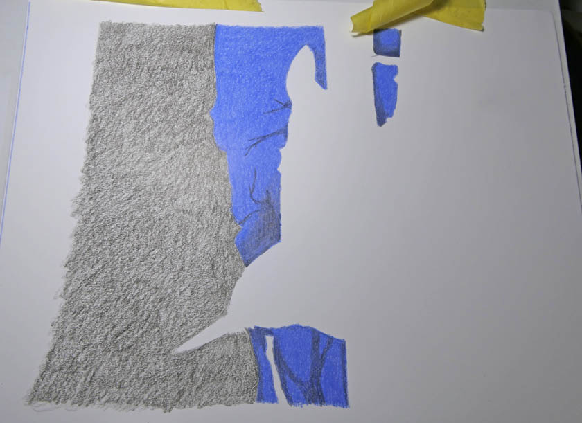
Once finished, I was pretty pleased with the work on the film, although I really wanted the left-hand tree to look darker-I had work to do on that to smooth out the colour. First, though, I would consider the background. Recently I’ve been doing plain, or bokeh, backgrounds using my PanPastels on a sheet of cheap (but acid-free) coldpress watercolour paper. For this piece, though, I wanted to be more precise in my placement of the background colour, the strong blue of the sky. I didn’t want it to stray onto the white parts of the bird (although I had reinforced the while a little by colouring on the back of the film-a good way to reinforce any of the colours, by the way, if you think that they need it and have lost the tooth on the front). Indeed, the blue background colour really didn’t need to be on any of the areas already coloured on the film-a big saving in pencil and time. So I chose a sheet of Strathmore 400 series Bristol smooth, a substantial upgrade on my normal pick for this purpose, and sketched in the areas to be coloured. I find that it works to tape the film above the background, so that it can be flipped back-and-forth, to check for overlaps or white areas left uncoloured.
Work-in-progress 2: Adding the blue. The film is taped above the background so that it is easy to check that the background colour is in the right spot
I decided to add a few additional stems and twigs, in a single dark colour (Luminance Payne’s Grey), to give the impression of trees even further back in the picture. It might look a little crude, but the film overlay will mute the edges to create a very ‘misty’ impression.
Now to finish off the left-hand trunk. I added a further layer of dark grey to the rear of the film, but it still wasn’t dark enough, so I went back to my background sheet. Some dark grey on the paper, followed by a layer of Coloursoft Brown-Black seemed to do the trick. I do like the Coloursoft for covering large areas. Much like the Derwent Drawing in feel, Coloursoft (also Derwent) live up to their name by being soft and easy to use. I don’t have many of them, because they are unfortunately not all lightfast, but the odd one comes in very handy sometimes, especially for backgrounds-being very soft they are not best suited for detail, but I have plenty of choices for that!
Work-in-progress 3: adding additional darks to the left-hand trunk area. Note the avoidance of the the bird, I didn’t want to compromise the white on the head.
This time the trunk was dark enough for me, so I was happy to call it done. It really was a fun project and I was very happy with how this one turned out.
‘White-breasted Nuthatch’, 8 x 9 inch coloured pencil (Lightfast, Luminance, Polychromos, Pablo) on Dura-Lar 0.005 double-sided matte film. Background is coloured pencil on Strathmore 400 series Bristol smooth.
As is my usual practice with the film pieces, I immediately cut a mat to fit it-it helps to protect and keep the two layers together, as well as really setting off the subject. It looks pretty good, I think!
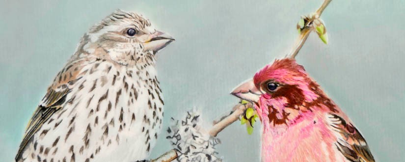
It’s been a while, or so it feels. Actually, I have had a piece on the board for some time, one of the ‘yard birds’ series, but it really was a bit of a slog. For some reason this picture just wasn’t doing it for me. I don’t really know why because the birds are lovely, Purple Finches. I used a couple of Mark’s photos, taken in our garden, as references.
Charmers, I’m sure you will agree.
I did have issues placing the images onto one sheet, so ended up with a somewhat conventional-looking arrangement of male and female facing each other. I like to avoid this, where possible, so preferring one bird, or three, even to a pair. Maybe that was the problem? Either way, I did struggle.
In the end I’m sort of ok with it, although I wouldn’t call it my best work!
‘Purple Finches’, 9 x 12 inch coloured pencil (Lightfast, Luminance, Polychromos, Pablo) on Dura-Lar 0.005 double-sided matte film.
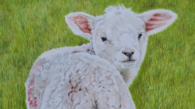
Another of those book cover commissions-well, I call them ‘commissions’ but it’s for one of Mark’s books. I’m not saying anything about the subject, or the title yet, suffice it to say that I was to draw a lamb. Now, I don’t have many lamb pictures (not feathered you see). In fact, the only sheep photos in my files were of grown-up ones. I was very taken by some very ‘pretty’ sheep we saw when we last went back to the UK (in 2018-yikes!) and spent a few minutes photographing them and even produced a piece (see Ewes’ Lookin’ at You?). I still like that one.
Nil desperandum, I turned to Pixabay and found just the photo for my reference.
Now I really wasn’t sure how to tackle that tightly-curled wool. Should I use a ‘proper’ paper or stick with the Dura-lar, which I’ve been pretty wedded to, recently? How would the latter medium take to this subject? Anyhow, I finally did plump for Dura-lar, we would see how that went.
To try and suggest the tightly-curled fur, it certainly wouldn’t work to try and draw every curl. Instead I focused on the darker patches between the curls to give this some structure and I was delighted when it seemed to work. Lots of pale colours, since the ostensibly white animal isn’t really white at all. The most useful colours, other than the Lightfast White, were Lightfast Moonstone, Fossil Grey and Oyster, and Luminance Buff Titanium, Pink White, Primerose, Silver Grey, French Grey 10%, French Grey 30%, Sepia 10% and Burnt Ochre 10%. My piece might not exactly mirror the reference photo, but I think it does give the right impression.
For the background, this was the first time I actually drew the background, in coloured pencil, on the drafting film itself. I wanted an idea of a grass field, but it didn’t need to completely mimic the photo. So I did a first background layer, all over, with Lightfast Foliage, using small circular motions to try and make as smooth a layer as possible, although I wasn’t too concerned as I knew that there was a lot more colour to add yet. Even just the first layer really made the lamb stand out! Then I followed this up with individual short strokes of Luminance Moss Green, trying to make sure that I drew from the bottom up, and also that the strokes got longer as I neared the bottom of the page.. After that, I added patches of Luminance Dark Phthalocyamine Green and Lightfast Ivy, Seaweed and Light Bronze. Additional Foliage helped to thicken up the background. Doing this reminded me that I hate doing grass (lol) but it did work out rather well. I wasn’t aiming for photo-realism here, I absolutely wanted it to look like a drawing.
‘Bah, Lamb’, 9 x 12 inch coloured pencil (Lightfast, Luminance, Polychromos, Pablo) on Dura-Lar 0.005 double-sided matte film.
As Mark would say, he’s just got to get on and write the book, now!
It’s been a while. My last post was all about the cover illustration for Mark’s most recent novel (see Clarence Wetbones). Of course, my involvement in these things isn’t limited to cover illustrations, so I got pretty involved in editing and book layout duties, which meant that the ‘Yard Birds’ series had to take a back seat. I was actually part-way through the next bird when the novel took precedence. Anyhow, I’m pleased to say that the latest Mark Dennis opus is published, as an ebook and paperback, on Amazon and we are pretty pleased with the result. Clarence looks rather good, I think!
‘Human skulls keep being pulled out of Colwick Lake. Do these wet bones indicate a psychopathic serial killer on the loose? is there maybe a coven of Witches active, practicing Black Magic on the park at night? It is down to D.I. Thompson and his team to dig out the truth.’
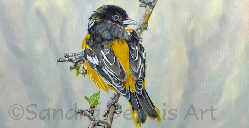
Anyhow, I finally had time to get back to my yard bird piece. This time I’d chosen another photo of Mark’s as my reference; a Baltimore Oriole photographed one May in this very yard. It was a pleasant reminder that ‘spring is sprung’, at least as far as the calendar is concerned, and we can expect to start seeing these birds returning to our gardens shortly.
The Baltimore Oriole is, famously, not named after the American city but after the English lord and proprietor of Maryland in the 17th Century, Lord Baltimore, due to the similarity in colour between the bird and his lordship’s coat of arms. Black and golden yellow still feature in the flag of Maryland.
Anyhow, its a handsome bird and always welcome back. I’m sticking with the drafting film for all of the Yard Bird series, and so I soon had the outline drawing set up. I decided to just feature the bird and twig it was on, rather than adding in the extraneous branches to the right of the picture, although I was a bit concerned that it might make for a rather empty sheet. I also stuck with the four main pencil sets.
Once I had time to concentrate on it, it only took a couple of days to finish the bird and the branch, and he was looking quite good. Now for the background.
The reference photo has quite a busy, blurred background, of branches and some spring foliage. Now, I could have plumped for my standard Pan Pastel bokeh but I thought that it might not have enough interest for this quite simple image. I rather wanted to try and emulate the patterns of the branches in the background. So I decided to use a different applicator for the pastel.
My Pan Pastel sets came with a variety of applicators, most of which I have just not used. Partly this is because replacements of the various foam pieces cost an arm-and-a-leg to buy and partly because I’ve found that I get a very acceptable bokeh effect using the cheap triangular wedge-shaped make-up sponges that I buy from the dollar shop.
Pan Pastel shades trayPan Pastel plus applicator spongesMake-up sponges as Pan Pastel applicators
So, I thought I’d break out one of the applicator wands, to be fitted with a tiny sponge sleeve. This allows more precise placing of colour than the wedge-shaped sponges.
You can swap between colours quite easily by cleaning the remainder of the previous colour off the sponge head on a piece of kitchen paper towel. After use, a wash in warm, soapy water freshens the sponge, ready for use another day.
So I tried to follow the reference photo for the placement of different areas of colour, using dark brown, dark green, spring green and bronze colours , generally in an up-down direction. Once the background was covered, I added in more branch-like shapes, using black and Payne’s grey. Finally, a light blending with colourless blender powder and a wedge-shaped applicator took the sharp edges away, leaving a hint of background foliage. I wasn’t sure I liked it, when I first did this background-it is one of the advantages of the drafting film that the background isn’t permanent, and I could make another one. However, it has since grown on me and now I rather think it works (apologies to the friend who prefers my backgrounds to be plain!). It looks quite the thing when matted in a plain white mat-something I tend to do quite promptly, especially for the drafting film pieces, to protect them and keep the two sheets together.
‘Baltimore Oriole’, 9 x 12 inch coloured pencil (Lightfast, Luminance, Polychromos, Pablo) on Dura-Lar 0.005 double-sided matte film. Background is PanPastel on Brea Reese 105 lb acid free heavyweight canvas watercolour paper.
Here it is, in the mat. The white framing always seems to lift the piece, or at least I think so.