
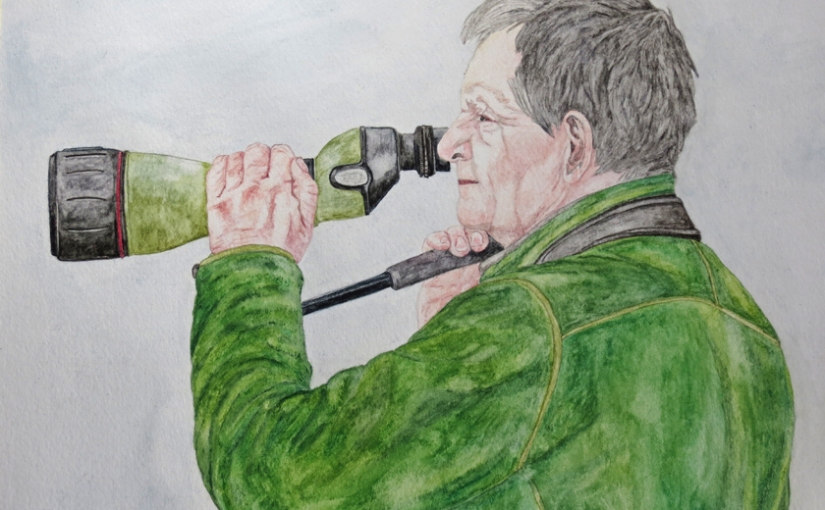
Well, here’s the thing. I really enjoyed doing the ‘portrait’ in the previous piece. ‘Cat-napping’, which was a bit of a surprise. I’ve never been that drawn to portraiture previously. So, I decided to capitalise on that feeling and have another go at a portrait, but who to ‘do’? Well, my husband, Mark, had previously said that I could have a go at him. The problem here is that Mark is notoriously anti-photograph, to the extent that I usually have to snap him by surprise or when he isn’t actually looking. Therefore, all of my photographs tend to be of Mark behind binoculars, a camera or a telescope!
The image I chose to try to draw was one with the telescope. We were at Cape St. Mary last week, looking at Harlequin Ducks off the end of the rocks, and he was trying to identify two distant specks, out in the Bay of Fundy, that might have been interesting Loons (but even he has to admit defeat, sometimes, especially when looking at things miles away, in a good swell and in fading light!). For one of my ‘surprise’ photos, it shows quite a lot of face unencumbered by optical equipment, whilst still giving the impression ‘Birder’.

Although I like the flesh tones in the Albrecht Durer set, I still think that the Derwent Watercolour Flesh Pink gives the most realistic base tone for those of us with pasty Northern European skins, so I started with this and then built up the different areas with the Albrecht Durer Light, Medium and Dark Flesh pinks, Caput Mortuum and Caput Mortuum Violet, Warm Grey III and a little Derwent Blue Violet Lake, a colour I have found very useful for shadowed areas. It was quite a cold and blowy evening so there were some brighter pinks than normal. Also Mark has very hooded eyes, which are difficult to portray accurately, especially from the side. He said that I would have to make lots of use of my ‘wrinkle pencil’, but I don’t think that was the case! Anyhow, he was gracious enough to say he thought that it looked like him, so I suppose that’s a success.

‘Birder’ 9 x 12 inch watercolour pencil (Caran d’Ache Supracolor, Derwent Watercolour, Faber-Castell Albrecht Durer, Staedler Karat) on 140 lb cold press watercolour paper (Canson XL).
I thought it might be interesting to look back on the two older sets of watercolour pencils and see which ones have been my ‘go to’ ones. Those, of course, are the shorter ones in the sets, now, and some are getting close to needing a pencil extender and/or the purchase of a new pencil!

These are the Derwent Watercolours, which were the first set of ‘artist-quality’ watercolours I bought, late last year.

The colours used most are Flesh Pink (as mentioned above, good for skin tones), Blue Violet Lake (shadowed areas), Blue Grey and Gunmetal (often used when doing rocks), French Grey (a nice ‘greige’) Sky Blue (in sky), 4 different greens (foliage) and Venetian Red (tree boughs and branches).

These are the Caran d’Ache Supracolors, added to the collection earlier this year.

In this set I have made particularly extensive use of Charcoal Grey (a really useful hark grey with hints of brown), Cocoa (a lighter brown with lots of grey), Black, Slate Grey (a really nice very dark grey with no blue tones), Grey (a colour with blue tones that I like in rocks) and Beige (a colour not often seen in pencil sets). In fact the greys and beiges have taken a hammering, but this probably reflects my preferred subject matter of birds and wildlife generally. You will see that I have included my most used pencil in the latter picture, the Staedler Karat Black. This tiny stub is too short now to be sharpened, so I’m using it in a pencil extender until it gets too blunt (I used it in this piece). I have had no luck yet in buying another one, although I tried in Staples, last time I was in there. Instead they had this set, Staedler Ergo-Soft:

Despite the snazzy plastic box, and the ‘coated’ leads to the pencils (supposed to make them harder to break), the black pencil in this set is no way as nice as the one in the Karat set. They are a definite student set, although the colours do seem to be quite bright.

No colour names, so that’s a down mark, straight away!
There are still pencils in both of the main sets that are yet to be used, other than to prepare my colour charts. I shall have to do more flowers, or butterflies, or, maybe, tropical birds, to get those bright pinks, reds, yellows and blues used!
